-
TeX is pronounced “tek” and is an English representation of the Greek letters τεχ, which is an abbreviation of τέχνη (or technē). Techne is a Greek concept that can mean either “art” or “craft,” but usually in a the context of a practical application. ↩
-
One noteworthy TeX predecessor was
eqn, a syntax that was designed to format equations for printing introff, which was a system developed by AT&T Corporation for the Unix in the mid-1960s. Theeqnsyntax for mathematics notation has similarities with TeX, leading some to speculate thateqninfluenced Knuth in his development of TeX. We do know that Knuth was aware oftroffenough to have an opinion of it—and not a good one. See p. 349 of TUGBoat, Vol. 17 (1996), No. 4 for more. Thanks to Duncan Agnew for bringingtroffto my attention and also pointing out that it was later replaced bygroff, which writes PostScript and is included in modern Unix-based systems (even macOS) and can be found via the man pages. Remarkably, it can still taketroff-based syntax developed in the 1970s and typeset it without any alterations. ↩ -
Knuth’s philosophy that computer code should be as human-readable and as self-documenting as possible also lead him to develop literate programming, a pivotal contribution to computer programming that has impacted every mainstream programming language in use today. ↩
- Take advantage of iMessage’s encryption for chats with friends and family
- Move your project or work communication to an app like Basecamp
- It makes the Pencil non-round, so it stays where you set it
- It is extremely sleek, preserving the svelteness of the Pencil’s design, yet the sleeve adds a bit of tackiness that I actually prefer when writing
- It’s magnetic, so it sticks to any iPad case
- Usually boring
- Longer than most people wanted to watch
- Too much of a hassle to upload due to their file size
- Remember to bring a camera with me
- Take pictures on film
- Physically deliver the film to a developer days later
- Wait more days for the film to be developed
- Physically pick up the developed photos
- Physically mail the photos to someone, who would receive them days later
- Remember to bring a camera with me
- Take a picture on a memory card
- Remove the memory card from the camera and insert it into a PC
- Upload to websites, instantly sharing with hundreds of people or more
- Pull out my phone and shoot
- Tap to share
- Shareable HD video from anyone’s pocket
- FaceTime and other wireless video calling
- Document scanning
- Snapchat, or more generally, the concept of photo messaging
- Augmented reality
From boiling lead and black art: An essay on the history of mathematical typography
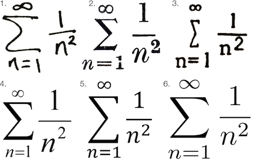 Math fonts from six different type systems, courtesy Chalkdust
I’ve always felt like constructing printed math was much more of an art form than regular typesetting. Someone typesetting mathematics is less a “typist” and more an artist attempting to render abstract data on a two-dimensional surface. Mathematical symbols are themselves a language, but they are fundamentally a visual representation of human-conceived knowledge—knowledge that would be too inefficient to convey through verbal explanations. This brings the typesetting of mathematics closer to a form of data visualization than regular printed text.
No matter how hard it’s ever been to create printed text, creating printed math has always been even harder. In pre-digital times, equation-laden texts were known as “penalty copy” because of the significant additional time and expense it took to set math notation for printing presses.
Even when modern word processors like Microsoft Word include equation editors, they tend to be difficult to use and often produce unpleasing results. While LaTeX and similar variants produce the highest quality digital math type, these frameworks also have much more of a learning barrier than general word processing.
But these modern quibbles are much more the fault of hedonic adaption than any of the tools available to us today. We have it vastly easier than any previous stage of civilization, and I think it’s critically important for those of us that write math to have at least a basic awareness of the history of mathematical typesetting.
For me, knowing this history has had several practical benefits. It’s made me more grateful for the writing tools I have today—tools that I can use to simplify and improve the presentation of quantitative concepts to other actuaries. It’s also motivated me to continue to strive for elegance in the presentation of math—something I feel like my profession has largely neglected in the Microsoft Office era of the last twenty years.
Most importantly, it’s reminded me just how much of an art the presentation of all language has always been. Because pre-Internet printing required so many steps, so many different people, so much physical craftsmanship, and so much waiting, there were more artistic layers between the author’s original thoughts and the final arrangement of letters and figures on pages. More thinking occurred throughout the entire process.
To fully appreciate mathematical typography, we have to first appreciate the general history of typography, which is also a history of human civilization. No other art form has impacted our lives more than type.
The first two Internets
While the full history of printing dates back many more centuries, few would disagree that Johannes Gutenberg’s 15th-century printing press was the big bang moment for literacy. It was just as much of an Internet-like moment as the invention of the telegraph or the Internet itself.
Before Gutenberg, reading was the realm of elites and scholars. After Gutenberg, book production exploded, and reading became exponentially more practical to the masses. Literacy rates soared. Reformations happened.
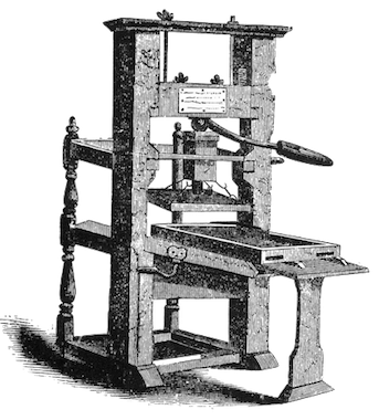 The Gutenberg Printing Press
I would argue that the invention of the printing press was on par with the evolutionary “invention” of human language itself. In The Origins of Political Order, Francis Fukuyama explains that spoken language catalyzed the separation of humans from lower forms of primates:
The development of language not only permits the short-term coordination of action but also opens up the possibility of abstraction and theory, critical cognitive faculties that are unique to human beings. Words can refer to concrete objects as well as to abstract classes of objects (dogs, trees) and to abstractions that refer to invisible forces (Zeus, gravity).
Language also permits practical survival advantages for families and social groups:
By not stepping on the snake or eating the root that killed your cousin last week, you avoid being subject to the same fate, and you can quickly communicate that rule to your offspring.
Oral communication became not only a survival skill, but a tool of incredible influence. Rhetoric and the art of persuasion were highly valued in Greek and Roman societies.
If spoken language was the first human “Internet,” mass printing was the next key milestone in the democratization of human knowledge. Mass production of printed material amplified the human voice by incalculable orders of magnitude beyond oral communication.
Of boiling lead and black art
Like all inventors, Johannes Gutenberg didn’t really make anything new so much as he combined existing materials and technologies in new ways. Gutenberg didn’t invent printing. He didn’t invent the press. He didn’t even invent movable type, which typically involves arranging (typesetting) casts of individual letters that can be brushed or dipped in ink and pressed to a page.
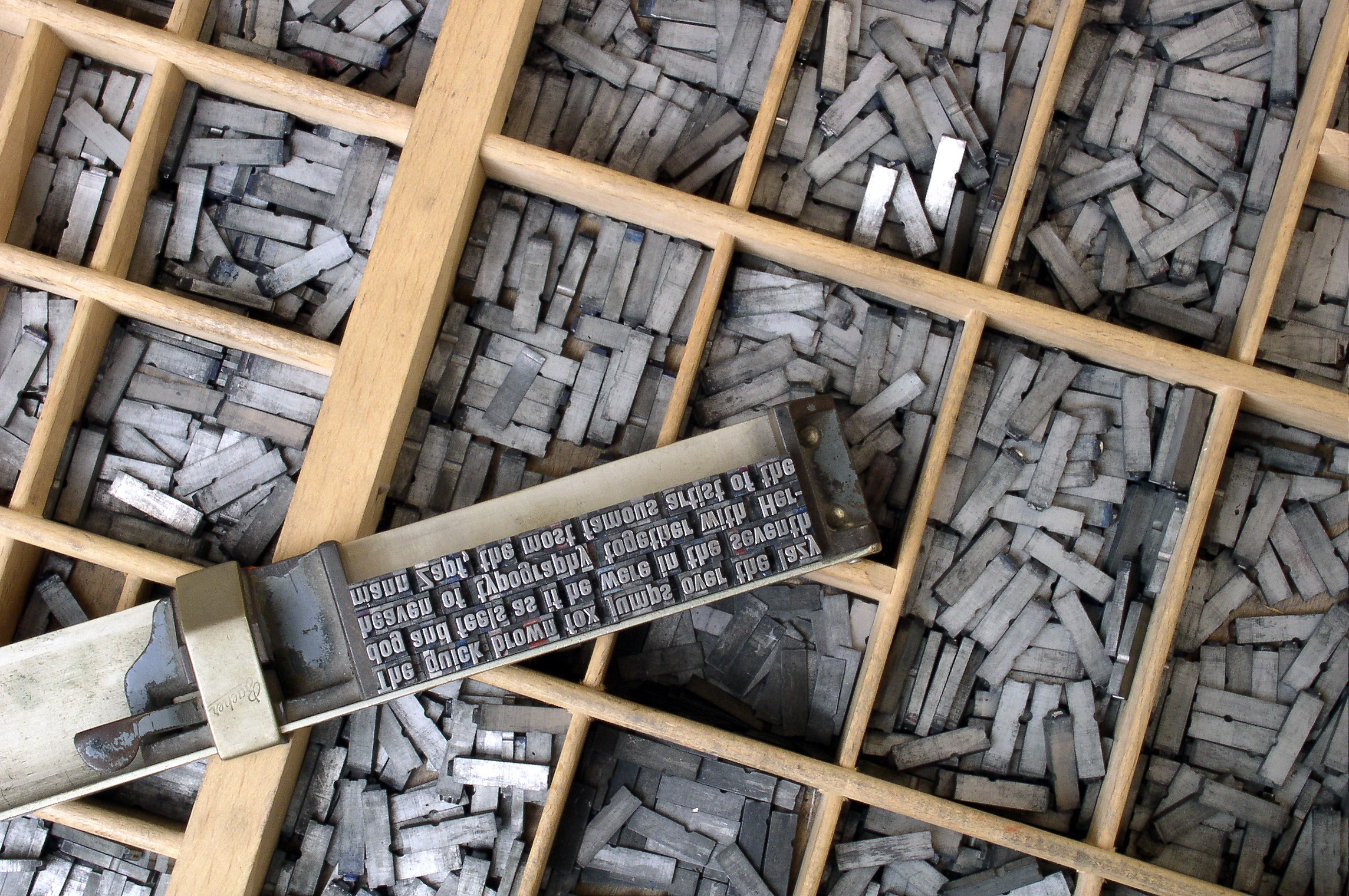 Metal movable type arranged by hand
Gutenberg’s key innovation was really in the typecasting process. Before Gutenberg’s time, creating letters out of metal, wood, and even ceramic was extremely time consuming and difficult to do in large quantities. Gutenberg revolutionized hot metal typesetting by coming up with an alloy mostly made of lead that could be melted and poured into a letter mold called a matrix. He also had to invent an ink that would stick to lead.
His lead alloy and matrix concepts are really the reasons the name Gutenberg became synonymous with printing. In fact, the lead mixture he devised was so effective, it continued to be used well into the 20th century, and most typecasting devices created after his time continued using a similar matrix case to mold type.
From a workflow perspective, Gutenberg’s innovation was to separate typecasting from typesetting. With more pieces of type available, simply adding more people to the process allowed for more typesetting. With more typeset pages available, printing presses could generate more pages per hour. And more pages, of course, meant more books.
But let’s not kid ourselves. Even post-Gutenberg, typesetting a single book was still an extremely tedious process. Gutenberg’s first masterpiece, the Gutenberg Bible (c. 1450s), was—and still is—considered a remarkable piece of art. It required nearly 300 pieces of individual type. Every upper and lower case instance of every letter and every symbol required its own piece of lead. Not only did each character have to be set individually by hand, justification required manual word spacing line by line.
 The Gutenberg Bible
Even though Gutenberg’s innovations allowed books to be printed faster than ever before, it was an excruciating process by today’s one-click standard. But it was within those moments spent arranging characters and lines that the so called “black art” of book printing flourished. Typesetting even a basic text was an intimate, human process.
A better way to cast hot lead
The art of hand-setting type would be passed down from generation to generation for over 400 years until the Industrial Revolution began replacing human hands with machines in all aspects of life. The most famous of the late 19th century technologies to refine typesetting were Monotype and Linotype, both invented in America.
The Monotype System was invented by American-born Tolbert Lanston, and Linotype was invented by German immigrant Ottmar Mergenthaler. Both men improved on the system Gutenberg devised centuries earlier, but each added their own take on the art of shaping hot lead into type.
Because Linotype machines could produce entire fused lines of justified lead type at a time, they became extremely popular for most books, newspapers, and magazines. Just imagine the look on people’s faces when they were told they could stack entire lines of metal type rather than having to arrange each letter individually first!
 Four lines of Linotype, courtesy Deep Wood Press
The Monotype System produced individual pieces of type. It could not produce the same lines per hour as Linotype, but it maintained the art and flexibility of setting individual pieces of type. Monotype also took a more mathematical approach to typesetting:
In many ways the key innovation in the Monotype System was not the mechanical device, ingenious as it was. To allow the casting of fully justified lines of type, Tolbert Lanston chose not to follow the path of Ottmar Merganthaler, who used tapered spacebands to create word spacing. He instead devised a unit system that assigned each character a value, from five to eighteen, that corresponded to its width. A lower case “i”, or a period would be five units, an uppercase “W” would be eighteen. This allowed the development of the calculating mechanism in the keyboard, which is central to the sophistication of Monotype set matter. (Letterpress Commons)
And so it was fitting that Monotype, while slower than Linotype, offered more sophistication and ended up a favorite for mathematical texts and publications containing non-standard characters and symbols.
The Monotype System is an exquisite piece of engineering, and in many ways represents a perfection of Gutenberg’s original workflow using Industrial Age technology. It’s also a fantastic example of early “programming” since it made use of hole-punched paper tape to instruct the operations of a machine—an innovation that many people associate with the rise of computing in the mid-20th century, but was in use as early as 1725.
Like Gutenberg, Lanston sought to refine the workflow of typesetting by dividing it into specialized sub-steps. The Monotype System consisted of two machines: a giant keyboard and type caster.
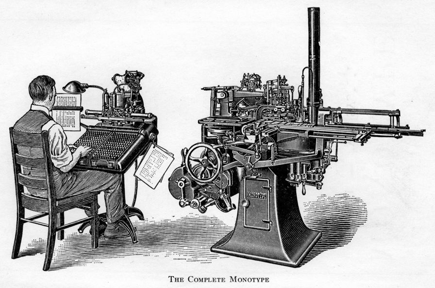
The keyboard had distinct keys for different cases of letters, numbers, and common symbols. The keyboard operator’s job was essentially to type character-by-character and make decisions about where to end lines. Once a line was ended, the machine would calculate the word spacing required to justify the line and punch holes into the paper tape. The caster was designed to read the hole patterns to determine how to actually cast the lines.
Therefore, a print shop could accelerate the “input” phase of typecasting by simply adding more keyboards (and people) to the process. This was a significant improvement over hand setting because a keyboard operator could generate more tape per hour than a human compositor could arrange type by hand.
The caster machine was also very efficient. As it read the tape line by line, it would inject hot, liquid lead into each type matrix, then output water-cooled type into a galley, where it came out pre-assembled into justified lines.
At this stage, the Monotype System offered a major advantage over Linotype. If a compositor—or anyone proofing the galley— found an error, the type could be fixed by hand with relative ease (especially if only a single character needed correcting).
It’s also easy to see why Monotype was superior to Linotype for technical writing, including mathematics. Even though the Monotype keyboard had tons of keys and could be modified for special purposes, it wasn’t designed to generate mathematical notation.
As I said earlier, no matter how hard it’s ever been to create text, creating math has always been even harder. Daniel Rhatigan:
Despite the efficiency of the standard Monotype system, mechanical composition could only accommodate the most basic mathematical notation. Simple single-line expressions might be set without manual intervention, but most maths call for a mix of roman and italic characters, numerals, Greek symbols, superior and inferior characters, and many other symbols. To ease the process, printers and Monotype itself often urged authors to use alternate forms of notation that could be set more easily, but the clarity of the subject matter often depended on notation that was more difficult to set.
Even if there were room in the matrix case for all the symbols needed at one time, the frequent use of oversize characters, strip rules, and stacked characters and symbols require type set on alternate body sizes and fitted together like a puzzle. This wide variety of type styles and sizes made if [sic] costly to set text with even moderately complex mathematics, since so much time and effort went into composing the material by hand at the make-up stage.
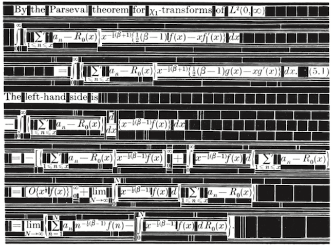 The complex arrangement of characters and spaces required to compose mathematics with metal type, courtesy The Printing of Mathematics (1954)
While the Monotype System would never fully displace the hand composition of math, UK-based Monotype Corporation made great strides toward this end in the 1950s with a new 4-line system for setting equations. The 4-line system essentially divided the standard equation line into four regions: regions one and two were in the upper half of the line, while regions three and four were in the lower half. It also allowed for a thin, two-point-high strip between the second and third regions. This middle strip was exactly the height of a standard equals sign (=) and was a key feature distinguishing Monotype’s 4-line system from the competing “Patton method” for 4-line math equations developed in the U.S.
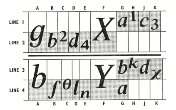 The 4-line system, via Daniel Rhatigan in “The Monotype 4-Line System for Setting Mathematics”
While Monotype’s 4-line system would standardize mathematical typography more than ever before, allowing for many math symbols to be set using a modified Monotype keyboard, it would prove to be the “last hoorah” for Monotype’s role in mathematical typography—and more generally, the era of hot metal type. Roughly a decade after the 4-line system was put into production, type would go cold forever.
The typewriter compromise
The 20th century, particularly post-World War II, saw an explosion in scientific literature, not just in academia but in the public and private sector as well. Telecommunications booms and space races don’t happen without a lot of math sharing.
Monotype was only a solution for publications worth the cost of sending to a printing press. Many technical papers were “printed” using a typewriter. Equations could either be written in by hand or composed on something like an IBM Selectric typewriter, which became very popular in the 1960s. Typewriters were office mainstays well into the late 20th century.
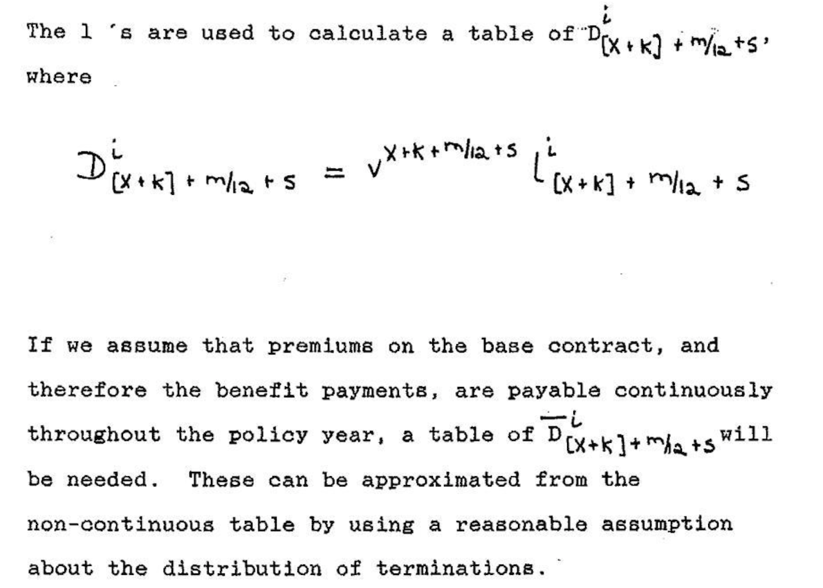 An actuarial paper composed by typewriter with handwritten math (1989)
Larger departments at businesses and universities not only had legions of secretarial workers capable of typing papers, but many had technical typists as well. Anecdotes like this one from a Math Overflow commenter, Peter May, highlight the daily struggles that took place:
At Chicago in the 1960’s and 1970’s we had a technical typist who got to the point that he, knowing no mathematics, could and did catch mathematical mistakes just from the look of things. He also considered himself an artist, and it was a real battle to get things the way you and not he wanted them.
The Selectric’s key feature was a golf ball-sized typeball that could be interchanged. One of the typeballs IBM made contained math symbols, so a typist could simply swap out typeballs as needed to produce a paper containing math notation. However, the printed results were arguably worse aesthetically than handwritten math and not even comparable to Monotype.
 An equation composed on an IBM Selectric typewriter, courtesy Nick Higham
Molding at the speed of light
As the second half of the 20th century progressed, technological progress would make it easier and easier to indulge those who preferred speed to aesthetics. In the 1960s, phototypesetting—which was actually invented right after World War II but had to “wait” on several computer-era innovations to fully come of age—rapidly replaced hot lead and metal matrixes with light and film negatives.
Every aspect of phototypesetting was dramatically faster than hot metal type setting. As phototypesetting matured, text could be entered on a screen rather than the traditional keyboarding process required for Monotype and Linotype. This made it much easier to catch errors during the keyboarding process.
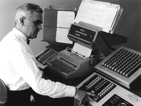 A man operating a Lumitype 450, a popular phototypesetting machine in the 1960s
Phototypesetters could generate hundreds of characters per second by rapidly flashing light through the film negative matrix. And instead of arranging lead galleys of type, compositors began arranging what were essentially photographs of text.
Phototypesetting also offered more flexibility. With a Monotype or Linotype machine, font sizes were constrained by the physical size of the matrix. Such physical constraints don’t apply to light, which could easily be magnified in a phototypesetter to create larger versions of characters.
Even though Monotype would linger into the 1980s in extremely limited use, it was essentially extinct by the mid-1970s. The allure of phototypesetting’s speed and low cost was impossible for print companies to resist.
Phototypesetting was indeed the new king of typography—but it would prove to be a mere figure head appointed by the burgeoning computer age. As we all know now, anything computers can make viable, they can also replace. Clark Coffee:
Without a computer to drive them, phototypesetters are just like the old Linotype machines except that they produce paper instead of lead. But, with a computer, all of the old Typesetters’ decisions can be programmed. We can kern characters with abandon, dictionaries and programs can make nearly all hyphenations correctly, lines and columns can be justified, and special effects like dropped capitals become routine.
In the late 1970s, computers had become advanced enough to do such things, but of course computers, themselves, don’t want to make art. Computers need instructions from artists. Fortunately for all of us, there was such an artist with the programming chops and passion to upload the art of typesetting into the digital age.
A new matrix filled with ones and zeros
While many probably looked at photo-composed typography with indifference, one man did not. It just so happened that there as a brilliant mathematician and computer scientist that cared a lot about how printed math looked.
Donald Knuth, a professor of computer science at Stanford University, was writing a projected seven-volume survey entitled The Art of Computer Programming. Volume 3 was published in 1973, composed with Monotype. By then, computer science had advanced to the point where a revised edition of volume 2 was in order but Monotype composition was no longer possible. The galleys returned to Knuth by his publisher were photocomposed. Knuth was distressed: the results looked so awful that it discouraged him from wanting to write any more. But an opportunity presented itself in the form of the emerging digital output devices—images of letters could be constructed of zeros and ones. This was something that he, as a computer scientist, understood. Thus began the development of TeX. (Barbara Beeton and Richard Palais)
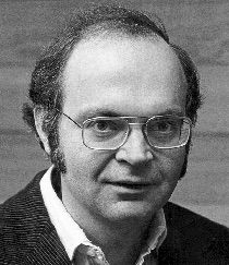 Donald Knuth (1970s)
By 1978, Knuth was ready to announce TeX (“tek”1) to the world at the annual meeting of the American Mathematical Society (AMS). In his lecture, subsequently published by the American Mathematical Society in March 1979, Knuth proclaimed that:
Mathematics books and journals do not look as beautiful as they used to. It is not that their mathematical content is unsatisfactory, rather that the old and well-developed traditions of typesetting have become too expensive. Fortunately, it now appears that mathematics itself can be used to solve this problem. (AMS)
The gravity of this assertion is difficult to appreciate today. It’s not so much a testament to Knuth’s brilliance as mathematician and computer scientist—there were certainly others in the 1970s with comparable math and computer skills.2 What makes Knuth’s role in typographical history so special was just how much he cared about the appearance of typography in the 1970s—and the fact that he used his technical abilities to emulate the art he so appreciated from the Monotype era.
This was not a trivial math problem:
The [hot lead era] Typesetter was solely responsible for the appearance of every page. The wonderful vagaries of hyphenation, particularly in the English language, were entirely in the Typesetter’s control (for example, the word “present” as a noun hyphenates differently than the same word as a verb). Every special feature: dropped capitals, hyphenation, accented characters, mathematical formulas and equations, rules, tables, indents, footnotes, running heads, ligatures, etc. depended on the skill and esthetic judgment of the Typesetter. (Clark Coffee)
Knuth acknowledges that he was not the first person to engineer letters, numbers, and symbols using mathematical techniques. Others had attempted this as early as the 15th century, but they were constrained by a much simpler mathematical toolbox (mainly lines and circles) that simply could not orchestrate the myriad nuances of fine typography.
By the 1970s, however, there were three key innovations available for Knuth to harness. First, math had become far more sophisticated: cubic splines made it possible to define precise formulas for any character shape. Second, computers made it possible to program Knuth’s formulas for consistent repetition. Computers also made it possible to loop through lines of text, making decisions about word spacing for line justification—even retrospectively hyphenating words to achieve optimal word spacing within a paragraph. Third, digital printing had become viable, and despite Knuth’s highly discerning tastes, he was apparently satisfied with its output.
In Knuth’s words:
… I was quite skeptical about digital typography, until I saw an actual sample of what was done on a high quality machine and held it under a magnifying glass: It was impossible to tell that the letters were generated with a discrete raster! The reason for this is not that our eyes can’t distinguish more than 1000 points per inch; in appropriate circumstances they can. The reason is that particles of ink can’t distinguish such fine details—you can’t print the edge of an ink line that zigzags 1000 times on the diagonal of a square inch, the ink will round off the edges. In fact the critical number seems to be more like 500 than 1000. Thus the physical properties of ink cause it to appear as if there were no raster at all.
Knuth was certain that it was time to help typography leap over phototypesetting—from matrices of hot lead to pages of pixels.
While developing TeX and Metafont, I’m sure Knuth had several “this has to be the future” moments—probably not unlike Steve Jobs standing over the first Apple I prototype in a California garage only a year or two earlier. Indeed, just like other more celebrated Jobsian innovators of the late 20th century, Knuth’s creative energy was driven by the future he saw for his innovation:
Within another ten years or so, I expect that the typical office typewriter will be replaced by a television screen attached to a keyboard and to a small computer. It will be easy to make changes to a manuscript, to replace all occurrences of one phrase by another and so on, and to transmit the manuscript either to the television screen, or to a printing device, or to another computer. Such systems are already in use by most newspapers, and new experimental systems for business offices actually will display the text in a variety of fonts. It won’t be long before these machines change the traditional methods of manuscript preparation in universities and technical laboratories.
Today, we take it for granted that computers can instantly render pretty much anything we can dream up in our minds, but this was closer to science fiction in the late 1970s. While the chief goal of TeX was to use mathematics to automate the setting of characters in the output, he also wanted the input to be as pleasing and logical as possible to the human eye.3
For example, the following TeX syntax:
$y = \sqrt{x} + {x - 1 \over 2}$
will render:
\[y = \sqrt{x} + {x - 1 \over 2}\]TeX was a remarkable invention, but its original form could only be used in a handful of locations—a few mainframe computers here and there. What really allowed TeX to succeed was its portability—something made possible by TeX82, a second version of TeX created for multiple platforms in 1982 with the help of Frank Liang. With TeX82, Knuth also implemented a device independent file format (DVI) for TeX output. With the right DVI driver, any printer could read the binary instructions in the DVI file and translate it to graphical (print) output.
Knuth would only make one more major update to TeX in 1989: TeX 3.0 was expanded to accept 256 input characters instead of the original 128. This change came at the urging of TeX’s rapidly growing European user base who wanted the ability to enter accented characters and ensure proper hyphenation in non-English texts.
Except for minor bug fixes, Knuth was adamant that TeX should not be updated again beyond version 3:
I have put these systems into the public domain so that people everywhere can use the ideas freely if they wish. I have also spent thousands of hours trying to ensure that the systems produce essentially identical results on all computers. I strongly believe that an unchanging system has great value, even though it is axiomatic that any complex system can be improved. Therefore I believe that it is unwise to make further “improvements” to the systems called TeX and METAFONT. Let us regard these systems as fixed points, which should give the same results 100 years from now that they produce today.
This level of restraint was as poetic as Knuth’s work to save the centuries-old art of mathematical typography from the rapidly-changing typographical industry. Now that he had solved the mathematics of typography, he saw no reason to disrupt the process solely for the sake of disruption.
Some thirty years after TeX 3.0 was released, its advanced line justification algorithm still runs circles around other desktop publishing tools. There is no better example than Roel Zinkstok’s comparison of the first paragraph of Moby Dick set using Microsoft Word, Adobe InDesign, and pdfLaTeX (a LaTeX macro package that outputs TeX directly to PDF).
Following 3.0, Knuth wanted point release updates to follow the progression of π (the current version is 3.14159265). Knuth also declared that on his death, the version number should be permanently set to π. “From that moment on,” he ordained “all ‘bugs’ will be permanent ‘features.’”
Refining content creation
In The TeXbook, Knuth beautifully captures the evolutionary feedback loop between humans and technological tools of expression:
When you first try to use TeX, you’ll find that some parts of it are very easy, while other things will take some getting used to. A day or so later, after you have successfully typeset a few pages, you’ll be a different person; the concepts that used to bother you will now seem natural, and you’ll be able to picture the final result in your mind before it comes out of the machine. But you’ll probably run into challenges of a different kind. After another week your perspective will change again, and you’ll grow in yet another way; and so on. As years go by, you might become involved with many different kinds of typesetting; and you’ll find that your usage of TeX will keep changing as your experience builds. That’s the way it is with any powerful tool: There’s always more to learn, and there are always better ways to do what you’ve done before.
Even though TeX itself was frozen at version 3, that didn’t stop smart people from finding better ways to use it. TeX 3 was extremely good at typesetting, but its users still had to traverse a non-trivial learning curve to get the most out of its abilities, especially for complex documents and books. In 1985, Leslie Lamport created LaTeX (“lah-tek” or “lay-tek”) to further streamline the input phase of the TeX process. LaTeX became extremely popular in academia in the 1990s, and the current version (originally released in 1994) is still the “side” of TeX that the most TeX users see today.
LaTeX is essentially a collection of TeX macros that make creating the content of a TeX document more efficient and make the necessary commands more concise. In doing this, LaTeX brings TeX even closer to the ideal of human-readable source content, allowing the writer to focus on the critically important task of content creation before worrying about the appearance of the output.
LaTeX refined the visual appearance of certain math syntax by adding new commands like \frac, which makes it easier to discern the numerator from the denominator in a fraction. So with LaTeX, we would rewrite the previous equation in this form:
$y = \sqrt{x} + \frac{x - 1}{2}$
LaTeX also added many macros that make it easier to compose very large documents and books. For example, LaTeX has built-in \chapter, \section, \subsection, and even \subsubsection commands with predefined (but highly customizable) formatting. Commands like these allow the typical LaTeX user to avoid working directly with the so-called “primitives” in TeX. Essentially, the user instructs LaTeX, and LaTeX instructs TeX.
LaTeX’s greatest power of all, however, is its extensibility though the packages developed by its active “super user” base. There are thousands of LaTeX packages in existence today and most of them come pre-installed with modern TeX distributions like TeX Live. There are multiple LaTeX packages to enable and extend every conceivable aspect of document and book design—from math extensions that accommodate every math syntax under the sun (even actuarial) to special document styles to powerful vector graphics packages like PGF/TiKZ. There is even a special document class called Beamer that will generate presentation slides from LaTeX, complete with transitions.
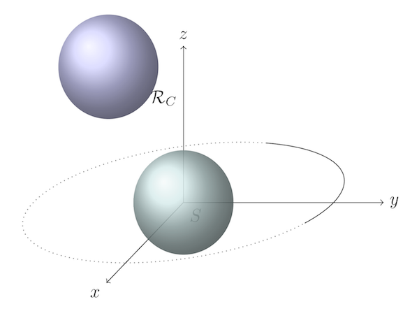 A 3D vector image created with PGF/TiKZ
Collectively, these packages, along with the stable underlying code base of TeX, make LaTeX an unrivaled document preparation and publishing system. Despite the popularity of WYSIWYG word processors Microsoft Word since the 1990s, they can’t come close to the power of LaTeX or the elegance of its output.
It’s worth noting that LaTeX isn’t the only macro layer available for TeX. ConTeXt and others have their own unique syntax to achieve the same goals.
Beyond printed paper
As sophisticated as TeX was, it filled the same role that typecasting and typesetting machines had since Gutenberg’s time: TeX’s job was to tell a printer how to arrange ink on paper. Beginning with TeX82, this was accomplished with a special file format Knuth created called DVI (device independent format). While the TeX file was human-readable, DVI was only printer-readable: essentially a bit matrix that told the printer which pixels should be black and which should remain white.
Even though computers began radically changing the print industry starting in the 1970s, paper would remain the dominant medium on which people read print through the end of the 20th century. But things began changing irreversibly in the 1990s. Computer screens were getting better and more numerous. The Internet also made it easier than ever to share information among computers. It was only natural that people began not just “computing” on computer screens, but also reading more and more on computer screens.
In 1993, Adobe unveiled a new portable device format (PDF) in an attempt to make cross-platform digital reading easier. PDF was essentially a simplified version of Adobe’s popular desktop publishing file format, PostScript, but unlike PostScript, PDF was designed to be easier to read on a screen.
PDF would spend most of the 1990s relatively unknown to most people. It was a proprietary format that not only required a several-thousand-dollar investment in Adobe Acrobat software to create, it also required a $50 Adobe Acrobat Reader program to view. Adobe later made Acrobat Reader available for free, but the proprietary nature of PDF and relatively limited Internet connectivity of the early 1990s didn’t exactly provide an environment for PDF to flourish.
By the late 1990s, however, PDF had gotten the attention of Hàn Thế Thành, a graduate student who wanted to use TeX to publish his master’s thesis and Ph.D. dissertation directly to PDF. Thành applied his interest in micro-typography to create pdfTeX, a version of TeX capable of typesetting TeX files directly to PDF without creating a DVI file at all.
pdfTeX preserved all of the typographical excellence in TeX and also added a number of micro-typographical features that can be accessed through the LaTeX microtype package. Micro-typography deals with the finer aspects of typography, including Gutenberg-inspired ways of optimizing the justification of lines—like using multiple versions of the same glyph and hanging punctuation techniques.
pdfTeX also harnessed the digital features of PDF, like hyperlinking and table of contents structures. As the general popularity of PDF continued to grow into the 2000s, and once Adobe released the PDF standard to the International Organization for Standardization in 2007, pdfTeX became an essential version of TeX. Today it is included by default in any standard TeX package along with pdfLaTeX, which interprets LaTeX files for the pdfTeX program.
It’s worth recognizing that Donald Knuth did not create TeX to speed up the publishing process. He wanted to emulate the appearance of Monotype using mathematics. But with the evolution of LaTeX, pdfTeX, and the Internet, TeX ended up enabling what probably seemed unimaginable to anyone waiting weeks for their galley proofs to come in the mail before the 1970s. Today, thanks to TeX and modern connectivity, we can publish extremely sophisticated documents for a nearly unlimited audience in a matter of seconds.
The next innovation in typography: slowing down
I think a lot of people have this idea that pure mathematics is the polar opposite of art. A left brain versus right brain thing, if you will. I actually think that math’s role in the human experience requires artistry as much as logical thinking: logic to arrive at the mathematical truths of our universe and artistry to communicate those truths back across the universe.
As George Johnson writes in Fire in the Mind:
… numbers, equations, and physical laws are neither ethereal objects in a platonic phantom zone nor cultural inventions like chess, but simply patterns of information—compressions—generated by an observer coming into contact with the world… The laws of physics are compressions made by information gatherers. They are stored in the forms of markings—in books, on magnetic tapes, in the brain. They are part of the physical world.
Our ability to mark the universe has greatly expanded since prehistoric people first disturbed the physical world with their thoughts on cave walls. For most of recorded history, writing meant having to translate thoughts through lead, ink, and paper. Untold numbers of highly skilled people were involved in the artistry of pre-digital typesetting. Even though their skills were made obsolete by technological evolution, we can be thankful that people like Donald Knuth fossilized typographical artistry in the timelessness of mathematics.
And so here we are now—in a time when written language needs only subatomic ingredients like electricity and light to be conveyed to other human beings. Our ability to “publish” our thoughts is nearly instantaneous, and our audience has become global, if not universal as we spill quantum debris out into the cosmos.
Today, faster publishing is no longer an interesting problem. It’s an equation that’s been solved—it can’t be reduced further.
As with so many other aspects of modern life, technology has landed us in an evolutionarily inverted habitat. To be physiologically healthy, for example, we have to override our instincts to eat more and rest. When it comes to publishing, we now face the challenge of imposing more constraint on the publishing process for the sake of leaner output and the longevity of our thoughts.
For me, this is where understanding the history of printing and typography has become a kind of cognitive asset. These realizations have made me resist automation a bit more and actually welcome friction in the creative processes necessary even for technical writing. It’s also helped me justify spending more time, not less, in the artistic construction of mathematical formulas and the presentation of quantitative information in general.
Technological innovation, in the conventional sense, won’t help us slow the publishing process back down. Slowing down requires better thought technology. It requires a willingness to draft for the sake of drafting. It requires throwing away most of what we think because most of our thoughts don’t deserve to be read by others. Most of our thoughts are distractions—emotional sleights of the mind that trick us into thinking we care about something that we really don’t—or that we understand something that we really don’t.
Rather than trying to compress our workflows further, we need to factor the art of written expression back into thinking, writing, and publishing, with the latter being the hardest to achieve and worthy of only the purest thoughts and conclusions.
But I already paid for it?!?!
Subscription-based app pricing is a thorny issue that’s far from resolved, but one of the very worst arguments I hear whenever a company like Ulysses switches to a subscription model goes something like this:
“Why do I have to pay (again) for software I’ve already purchased?”
This is a flat out lie that people usually create for themselves to help support their negative reaction to a perceived price increase. The lie basically says, “if I want to keep using this app, I need to pay for it again.” In many cases, including the case with Ulysses, this is completely false. Ulysses clearly addresses this on their site:
The previous, single-purchase versions of Ulysses have both been removed from sale. They remain fully functional, of course, and we have even updated both versions for High Sierra and iOS 11 respectively. So, if you decide to keep using the “old” Ulysses, you should not encounter any problem. New features, however, will only be added to the subscription version in the future.
So there. The software you paid for is still “yours” in the sense that it is fully functional (as you paid for it) and will continue working indefinitely. You “own” it, and it’s not going away.
Will it work forever? Hell no. Software isn’t the same as a cast iron skillet. Software isn’t going to work the same 100 years from now. It’s probably not even going to work 100 weeks from now without being nursed through the vagaries of operating system updates, security patches, and user-expected support. When the developer of a cast iron skillet is done, they’re done. When the developer of a piece of software is done, they’re out of business—because if a developer quits, so does their product.
The more you can look at your software as a knowledge product—a product that rapidly decays without the service of its developers, the more subscription pricing makes sense objectively.
But that’s the crux. Software needs human buyers, and our brains are poorly evolved to evaluate the many abstractions of our modern economy.
Dave, this conversation can serve no purpose anymore. Goodbye.
Via Hobo Signs:
An artificial intelligence system being developed at Facebook has created its own language. It developed a system of code words to make communication more efficient. Researchers shut the system down when they realized the AI was no longer using English.
The observations made at Facebook are the latest in a long line of similar cases. In each instance, an AI being monitored by humans has diverged from its training in English to develop its own language. The resulting phrases appear to be nonsensical gibberish to humans but contain semantic meaning when interpreted by AI “agents.”
Our ability to think about abstract things makes us very different from other animals. It’s why we have big heads, big philosophies, big religions, and, many times, big problems with absolutely no basis in the physical world.
We’re in the middle of a really fascinating experiment in civilization that started around the time of Industrial Revolution, but really got going in the second half of the 20th century when computers (machines) enabled our abstract thinking to affect the physical world by significantly higher orders of magnitude.
We’ve already seen that mixing humans and advanced technology can have undesirable effects. The financial crisis of 2008 happened in large part because really smart people on Wall Street created financial structures that became too abstract for even their creators to fully understand—especially when set loose in the market to mix with human emotion and other financial structures.
The “good news” with failures of financial abstraction is that they can, apparently, be corrected by offsetting measures of abstraction like the creation of additional (abstract) money. Complicated financial structures also collapse when they are no longer believed in—like bad dreams.
AI is different in that it could very well evolve into something that surpasses DNA-based organisms. AI, once fully viable, may not collapse so easily, if at all.
A nod to checklists
Gabe whipped up a great list of checklist tools. My favorite aspect of his post is that there’s no clear winner. There shouldn’t be.
Checklists can come in all forms, and the ideal format depends entirely on the application. For me, checklists make sense when I need to see not only what needs to be done, but also what I’ve already done. Apps that automatically “vanish” completed tasks fail to do the latter.
For me, sometimes there’s just no substitute for a spreadsheet for large checklists, especially if each item can have multiple statuses or dimensions. Sometimes adding more columns is way more efficient than adding more tasks (rows).
For packing lists, I’ve tried so many apps, but OmniOutliner is the best for me. It’s simple checkbox feature is perfect, and I have several templates I use for different types of trips.
Sometimes an Apple Note will suffice, and sometimes I just “x” lines in Drafts for a quick and dirty grocery list.
When I’m working with large numbers of LaTeX files on my Mac, I use file colors, prefix schemes, and even moving files from one folder to another to keep what I’ve processed and what I haven’t.
Checklists are as old as civilization and are one of the most fundamental ways to augment the human mind, which needs help seeing where it’s been and where it needs to go. Everyone can benefit from checklists. Just check out The Checklist Manifesto.
A couple of Jekyll updates
Since moving to Jekyll last year, I’ve done relatively little to tweak the inner workings of this site. After all, one of the most appealing things about having a static site is that it doesn’t need to have a lot of moving parts. It just works.
But today I finally got around to a couple of housekeeping items that have been on my list: image captions and MathJax.
Image captions
For image captions, I settled on a beautifully simple solution posted by Andrew Wei on Stack Overflow:

*image_caption*
This takes advantage of the fact that you can create CSS for combinations of HTML elements. In this case, I can use
img + em { display: block; text-align: center;}
to target the *image_caption* text only and center it under images, which are also centered on this site by default. It works perfectly, and this isn’t even Jekyll-specific. Anyone publishing in Markdown could do this.
 Agreed.
Jekyll + MathJax
Adding MathJax took a little more time, but not much. It was worth it just to remind me of the brilliance of Jekyll’s architecture. Even though the Jekyll site mentions MathJax, it doesn’t say enough to be of immediate use. It basically points to a blog post that entails switching from the default kramdown Markdown converter to redcarpet. Given that I’m happy with kramdown and not in the mood to backtest a bunch of blog posts with a different converter, I wanted to stick with kramdown.
A series of subsequent web searches lead me to a Github issue thread for a Jekyll theme that I’m not even using, but I found a really efficient implementation of MathJax there by user “mmistakes,” who suggested adding a mathjax variable in each page’s YAML front matter that could be set to true on a post by post basis.
The elegance of this solution is that the MathJax script will only be written into the HTML of posts that actually have MathJax in them. This seemed super appealing to me because it meant that I didn’t have to worry about MathJax being triggered by some accidental combination of characters in an old blog post.
I ended up adding
{% if page.mathjax %}
<script type="text/javascript" async src="https://cdnjs.cloudflare.com/ajax/libs/mathjax/2.7.1/MathJax.js?config=TeX-MML-AM_CHTML">
</script>
{% endif %}
to my head.html file, which contains Ruby instructions for building the contents of each page’s <head> element. For any page where the YAML front matter has mathjax: true, the MathJax script will be included. I decided to always include it in the site’s index.html file, which shows recent posts. And going forward, I can simply include it in the YAML front matter of any individual post. For example, this post’s front matter is:
---
layout: post
title: A couple of Jekyll updates
mathjax: true
---
I just finished up a project where I worked with MathJax a lot, and I continue to be impressed at how many LaTeX commands it handles. MathJax even has a special enclose library that handles special actuarial notation that eludes so many people. For example,
$$\require{enclose} {}_{17|}\ddot{a}_{x:\enclose{actuarial}{n}}^{(4)}$$
turns into:
\[\require{enclose} {}_{17|}\ddot{a}_{x:\enclose{actuarial}{n}}^{(4)}\]Fun.
Look but don't type
Even though Gabe and I sometimes have slightly differing views on the iPad’s productivity value compared to the Mac, with his latest post, I think we are completely in sync—metaphorical Chris Farley falls and all.
In particular, he nails a massive friction point for me with the iPad:
I can type more comfortably on my iPhone than I can with my iPad Pro on the couch, in bed, or even just reclined in the backyard. I’m sure there’s a good case out there that will solve this problem, but I’d rather see Apple solve it.
I’ve tried using various keyboards for my 13” iPad Pro, but I’ve never found one that let me comfortably type while sitting away from a flat table or desk. This has been a huge failure point from a practical perspective for me because the iPad, by design, begs to be used away from conventional “work stations.” So the irony is that the only time I can do serious word creation on my iPad is while sitting at a desk or table.
If I want to escape those confines, which is a frequent want, I use my 13” MacBook Pro, which has the same form factor as the big-big iPad, but allows for lap typing.
Like Gabe, I also find myself in the funny position of using my iPhone to type more, even when my iPad is at hand. A great example: if I’m reading a book on my iPad, it’s actually easier to write notes about the book using my iPhone. I even wrote this entire post in Drafts on my iPhone at the breakfast table. My iPad is in sight across the kitchen.
I still use the iPad a lot, but its use cases for typing still remain very limited for me. The Mac and iPhone just have superior keyboard forms.
It doesn’t want anything
Tim Cook’s entire commencement address to the MIT class of 2017 is an instant classic, but this is the part I want to echo forever:
Technology is capable of doing great things. But it doesn’t want to do great things. It doesn’t want anything. That part takes all of us. It takes our values and our commitment to our families and our neighbors and our communities. Our love of beauty and belief that all of our faiths are interconnected. Our decency. Our kindness.
I’m not worried about artificial intelligence giving computers the ability to think like humans. I’m more concerned about people thinking like computers without values or compassion, without concern for consequences. That is what we need you to help us guard against. Because if science is a search in the darkness, then the humanities are a candle that shows us where we’ve been and the danger that lies ahead.
Thinking out loud about the Apple Watch
PCs lead us indoors. Smartphones lead us into isolation. The Apple Watch is—sort-of—leading us back out into the real world again by encouraging movement, keeping phones in pockets, and most importantly, looking up again.
I’ve owned an Apple Watch since the Series 0 started shipped 26 months ago. I can’t imagine ever not owning one again. Actually I can, but only when some higher form of “wearable” supersedes the form of a wrist watch.
If I were to say, “I’m more active because of the Apple Watch,” a non-Watch person might say “You shouldn’t need a watch to make you more active. After all, people were active for millennia without smart watches.”
Well played armchair anthropologist, but that perspective overlooks the motionlessness of modernity. In the blink of an eye, humans have simply stopped moving. Being indoors with technology is too appealing, and our bodies,… on yeah, we still have bodies! We have all kinds of shit going on besides thumbs and eyes. Well, we should probably move the other parts around a little. Who knows—maybe even a lot.
In other words, we’re poorly adapted for the environment we suddenly created for ourselves at the turn of the 21st century. But we are human. And we are nothing if not interested in solving the problems we create for ourselves. I think health-aware technology is a natural adaptation to health-hostile effects of generations one and two of personal computing.
Oh yeah… I just bought a new Apple Watch. More honestly, I just bought a new health-tracking wrist computer that’s more waterproof so I don’t have to take it off when I go swimming with my kids—the only time I’ve had to take off my original Apple Watch in the 26 months I’ve owned it.
Bigger picture, I’ve decided that if I’m going to have the benefits of technology that makes me sit still, I also need technology to counteract that. This is life, and these are not horrible problems to have to solve.
One-off shell script execution in BBEdit
I’ve been meaning to talk more about my “Sublime Text and BBEdit” workflow, and this is a powerful (if mundane) example.
I don’t write a ton of scripts on my Mac and generally don’t spend much time in Terminal. But when I need a script, I really need a script. My work is very file-heavy. I juggle large numbers of .tex (LaTeX) files across several large folder structures. Every so often I need to copy a subset of files within one folder to another folder so that I can do things to them.
In most cases, I have a list of the files in a plain text .tex file, and I just need to do some file operations on them. Selecting them individually in Finder is tedious and error-prone, so the solution is usually a simple bash script with a bunch of cp commands.
The main friction with bash scripting for folks like me that don’t live in Terminal is that you have to create a .sh script and then web search for now to make it executable (because I can never remember the chmod command).
Creating the shell commands is straightforward, especially in Sublime Text. After adding the necessary #!/bin/bash line with TextExpander and defining the “to” and “from” file paths as variables, the magic of Sublime Text’s multiple cursors makes it easy to put cp commands and the folder path variables around each file to be copied.
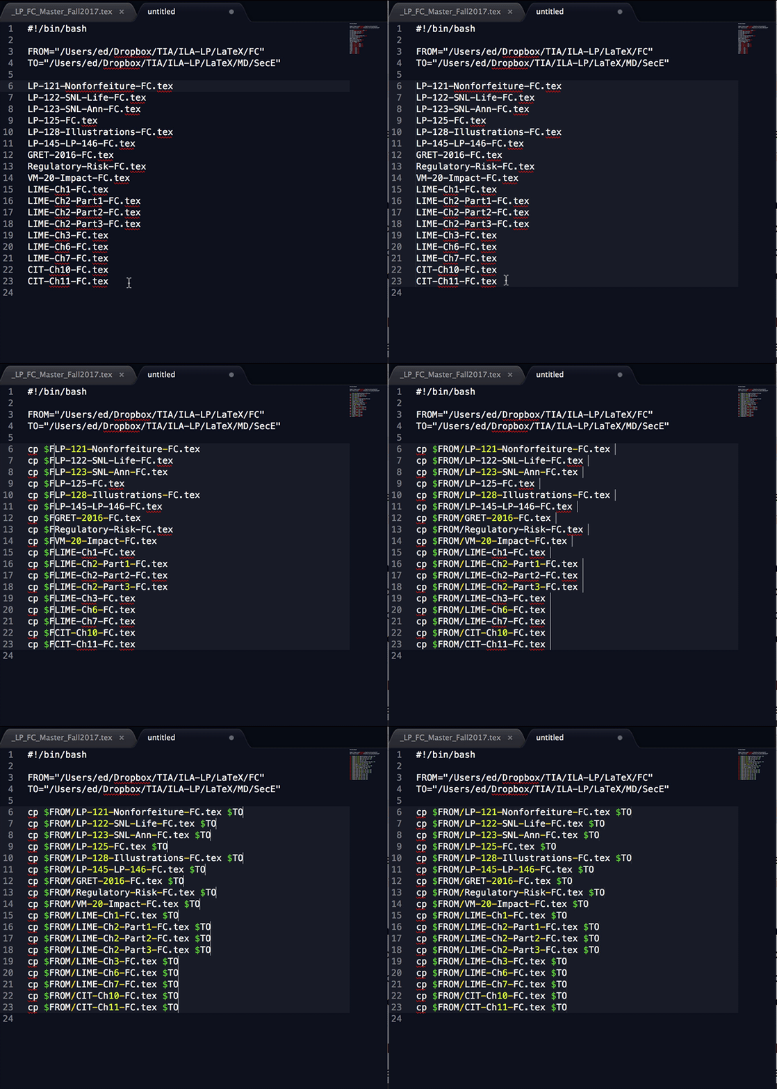 Sublime Text multiple cursors in action
Since Sublime Text won’t execute these commands in an unsaved file that hasn’t been given proper execute permissions, I simply copy this text into an untitled, unsaved BBEdit window and hit ⌘R. BBEdit has the extremely useful ability to immediately recognize the syntax and execute it right there on the spot.
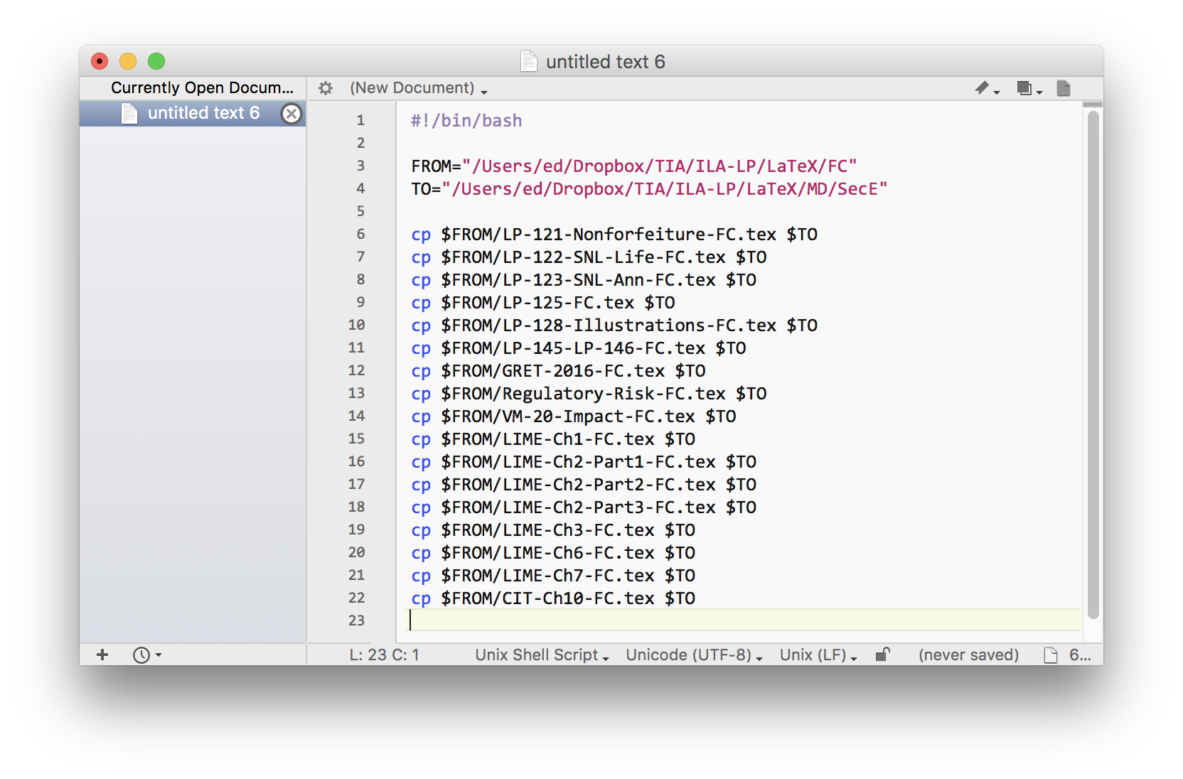
I realize this post is a weird way to promote BBEdit, which is a powerful text editor that, in this case, I’m not even using as an editor. Hopefully I’ll find some time to talk more about other ways I’m using it with Sublime Text.
Lessons from the president
Like many other parents, I’ve struggled to make sense of the current president in the context of parenthood. How do you even talk about it?
But I’ve realized that much can be taught by studying the commander-in-clown’s example. After all he’s the perfect anti-role model for young kids, teens, and adults of all ages: someone we should all aspire not to be when we grow up.
Here are the top five lessons we can learn from our president.
5. Things you put on social media are permanent.
If you tweet strong, emotionally charged opinions reflexively, they will almost certainly come back to haunt you.
What’s better: Think before you act. Ask for advice. Do like Lincoln, and write an angry letter that you never send.
4. People who constantly attack others verbally are highly insecure.
The more they attack, the more they broadcast their insecurities and invite hate from others. Bullies seem a lot less intimidating the more you realize that they are more terrified of the world than you are of them.
What’s better than being a bully: Promote things you truly believe in. Use positive reinforcement to advance just causes. If you need to be critical, support your position with facts, and don’t contradict yourself or allow yourself to be distracted by things that trigger your insecurities.
3. It’s OK to be wrong, but you have to admit it.
Everyone is wrong about something. Vulnerability is mightier than the strongest ego. It will win you the most loyal followers.
2. Very wealthy people who attempt to increase their wealth at all costs are not heroes of capitalism.
They are among the greatest cowards on earth. They live in constant fear of losing what they have and will never experience even basic happiness.
What’s better: Use your excess to help others. Be in constant thanks for what you have rather than dwell on what you don’t have. You will be happier and healthier.
1. Credibility and trust are vital ingredients of leadership.
A ruler who rules only by law will never be as effective as a leader who rules by trust. If no one trusts you, then you cannot trust anyone either. That’s a perfect model for a miserable life—whether you are a clown, the leader of the free world, or both.
The boring truth about email security
David Sparks and John Gruber have said all that needs to be said about the revelation that Unroll.me was selling its users’ email data.
It was easy for me to delete my Unroll.me account because I had really stopped looking at it already. Last year, I decided to just get out of the way of my email and just let Gmail’s stock filters for “social,” “promotions,” and “updates” channel 80% of my email into those non-action buckets.
On the surface, it may seem odd that I would favor one ad company over another: dump Unroll.me but stay with Google’s Gmail. A lot of people have ostensibly moved away from Gmail for the same reason people were throwing up in their mouths over Unroll.me this week.
But I have been using Gmail for a long time, and I have no plans to leave now. I understand that Google sees my email and pours it into its Alphabet soup, and I’m OK with that—not because I think Google is especially benevolent, but because I accept the truth about email data.
I think a lot of people who leave Gmail because of privacy concerns are following the false hope that another company can magically “secure” their email. The truth is that your email will never be totally private. With the exception of email you send to yourself, email takes at least two servers to tango.
Every copy of every email sent to/from you resides on some other email server. If you regularly email a specific person, there are probably thousands of your emails on their hard drive—perhaps the one in the old computer they just sold without wiping the hard drive.
In other words, email is not the same as your note archive or your document repository. Email is necessarily out there. Everywhere.
So in my mind, the solution to email privacy is email avoidance:
That’s what I’ve done. Today, I see my email as a bloated version of Twitter: a constant inflow of chaff with the occasional strand of wheat, which mostly takes the form of customer email.
I have no control over how many computers email me every day. But I can definitely control how much email I create myself.
Be still my rolling Pencil
If I’m using my iPad Pro, I’m almost always using my Apple Pencil, too. For me, the Pencil was a massive extension for the iPad and basically made it the go-to environment for reading, studying, and annotating PDFs.
The Apple Pencil is great at many things. Staying still on a flat table is not one of them.
I’ve tried several accessories and tricks for keeping the Pencil from racing away, but nothing works as well as the FRTMA Apple Pencil Magnetic Sleeve.
The magnet is very strong. When attached to an iPad case, you can shake the case really hard, and it will not come off. It will, however, come off sometimes when it’s in my backpack, but in my experience, “losing” my Apple Pencil inside my backpack is the very best place to lose it—far better than seeing it race across a flat table and down the stairs of my favorite coffee shop.
From clips to stories
Renie Ritchie apparently wrote a treatise on Apple’s new Clips app, but don’t let that intimidate you. Clips is ridiculously easy to use, and most of its features are discoverable by just playing with it.
The real brilliance of Clips is that you don’t even feel like you’re doing movie editing, but that’s exactly what you’re doing. Being able to shoot video is just one step of making a visual story. A movie obviously can’t exist without that step. But in my opinion, editing is way more important. Cutting, blending, and curating is what really makes something a story.
I think the “cutting” step is what most iPhone-created movies need the most. I went a long way in solving this problem (accidentally) when I started using Snapchat about a year ago. Before Snapchat, I shot plenty of video with the iPhone, but I almost never did anything with it. The main problem was that my videos tended to be too long. This made them:
So on my phone they sat—unwatched.
The more I used Snapchat for video, the more I realized the brilliance of its ten-second limitation. This constraint made it impossible to shoot long, boring videos and also forced me to throw away outtakes immediately. Before long, I wasn’t just using Snapchat to send video snaps, I was saving the videos to my phone.
Now that Clips is here, I’m using the iPhone’s camera app for video more often, but I’m still shooting very short duration clips a la Snapchat. Clips makes it ridiculously easy to fuse some or all of any video into a series of clips. Being able to mix videos and pictures into a single clip creates the same effect of a Snapchat story, but it keeps everything on my phone so that I can share it in other ways—notably with people who don’t use Snapchat.
It’s really the story you should be after.
If you pay attention to almost any TV show, movie, or professionally-made internet video, the very longest shots last no more than than five to eight seconds. In action movies, shot length can average as little as two seconds! Some action movies have over 3,000 shots in them. Changing scenes and angles just makes the visual aspect more engaging.
I used Clips to make a couple of short “movies,” each consisting of 5–10 short videos and photos I took last week on a family vacation. In a lot of cases, I only grabbed a few of the best seconds of each clip. Creating each “movie” took just minutes using only my iPhone. I’m 100% sure none of those individual videos would have gotten shared if I hadn’t used Clips to make them into a story.
Thoughts on iOS automation
It’s funny to hear so many people complain about the lack of automation in iOS. In reality, iOS automation has already happened. We were just looking the other way, and when we turned around, we couldn’t remember what was there before.
I can’t think of a better measure of the success of automation than how quickly an automated process becomes forgotten. Automation’s role in the human experience, after all, is to make us forget. Automation frees us to work on new problems beyond the old problem horizon. Automation paves over cavernous ravines, replacing them with short, straight paths to the adjacent possible.
There are countless examples of how iOS has done this. Take photography.
Before the PC, the steps to share pictures usually spanned weeks:
When digital photography and the PC arrived, the process shortened, and the output expanded:
Once the iPhone camera fully came of age, the steps became:
Weeks reduced to seconds. The need to bring a physical object with me: gone. The monetary cost of photography: eliminated. And in many cases, the quality of the final product: dramatically better.
The hassles of pre-iPhone photography: forgotten.
The adjacent possibilities unlocked by the confluence of the iPhone’s camera and mobile connectivity:
There are so many examples of other things iOS has automated that we never even thought needed automating. Just look at your home screen. The iPhone is essentially a universal remote for modern life.
Traditional computer automation (scripting, better inter-app communication, etc.) is a pretty narrow frontier of iOS automation yet to be fully solved. I’m not convinced that it even needs to be solved as long as we have traditional computers with open file systems. But I believe it will either be solved, or the need for solving it will be obviated by other advances in iOS.
For now, I will continue to enjoy using iOS and macOS, which are much greater together than they are apart. It is impossible to predict the future, but I’m pretty sure we can rule out a “single device for all uses” scenario.
Computers will continue to automate things we never associated with computers. We will continue looking for new problems. And we will continue forgetting about the tedium of times gone by.
And, not or
During Sal Soghoian’s appearance on Mac Power Users, he talks about his philosophy on “and, not or”:
A lot of people mistakenly embrace the concept of or when it’s not necessary. There really needs to be and. And and doesn’t necessarily cost more… it just offers more.
Every minute of this show is worth listening to because Sal exudes genius every time he speaks, but his “and, not or” philosophy is a seriously great piece of wisdom, and I hope that now that Sal is outside of Apple he has more opportunity to speak and write about it.
In my experience—observing both myself and others—the “or” mindset usually leads to paralysis or unneeded time spent rebuilding an entire workflow to fit perfectly in a new framework.
The most agile, modular solution is usually some of this and that. “Or” breeds an “all or nothing” approach that usually just ends in nothing. “And” moves things forward
What’s the best computer for productivity? A MacBook and an iPad Pro.
Where should I store notes? DEVONthink and Apple Notes.
Where should I write? Drafts and Ulysses and Sublime Text.
What’s the best way to outline? Plain text and iThoughts and OmniOutliner.
What camera should I use? A DSLR and my iPhone.
What’s the best way to sketch a visual design concept? Real paper and an Apple Pencil / iPad.
Where do tasks belong? OmniFocus and Reminders and TaskPaper.
What PDF app should I use for mark up? PDF Expert and LiquidText and Notability.
In each case, the “and” mindset lets my mind get out of the way of itself. “And” imposes less friction between ideas and actions.
