Productive OmniFocus styling
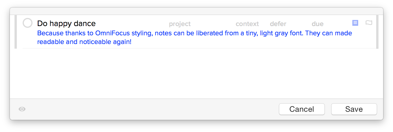
In case you didn’t hear, OmniFocus 2.5 finally brings back custom styling. Overall, I’ve been happy with the general OmniFocus 2 UI design choices. Except for one major fault: the default task note text color is miserably hard to read. I spent about five minutes fixing this with the OmniFocusColors app, and I’m not looking back.

For me, task notes are super important—as important if not more than the task itself. I want to notice them and use them.
