- Create an inbox action with a project title
- List individual actions in the notes section (one on each line)
- Save
- Select and copy tasks in note field
- Make sure you have at least one blank action under the project
- Make sure that your cursor is not inside the action editing it (i.e. press
escto select the entire action as a unit) - Paste
- Add new feeds
- Remove feeds
- Move feeds to different folders
- Add and remove folders or tags themselves
- Individually select pages in the sidebar (or ⌘A for all)
- Click the Select Tool button (or ⌘3)
- On any page, select the area of the page you want to remain visible
- Tools > Crop (⌘K)
-
It’s worth noting that you could use the OmniFocus Clip-O-Tron mail plugin to add email to your OmniFocus inbox. I’ve never figured out how to fit this into my workflow, though. I prefer to have tighter control over what goes into my OmniFocus inbox. I see the act of processing email as time-dimensioned task itself. And in some cases, email resolves itself before I even get back to my Mac. If every flagged message automatically went to my OmniFocus inbox, I would probably start avoiding my OmniFocus inbox. ↩
The case for boring charts
Modern spreadsheet programs offer all kinds of chart options. Most suck.
Dr. Drang recently called out the stacked area chart. I completely agree with the good doctor that stacked area charts do a poor job of exposing trends in data.
Whenever I attempt to present data that vary with time, I always start simple—with a line chart. Yes, line charts are boring. They’ll win you few to nil artistic points.
Consider Dr. Drang’s market share data in the form of a line chart:
<img src="/img/drang-market-share-pe.png" alt=""/>
No, it’s not obvious that the y-coordinates sum to 100 percent at each time step, but I think that’s secondary to making the trend in the data crystal clear.
I’m no cognitive psychologist, but I think the human mind naturally looks for lines in charts. Stacked area charts have a way of implying lines where they don’t really exist.
Line charts are less apt to create optical illusions because what you see is what you get. The reference point for each line is the same: the horizontal axis. There’s no question that Orange is falling, Blue is rising, and that Green is increasingly linearly.
Because trends are so immediately clear in a line chart, viewers will spend time contemplating the meaning of the trends rather than wasting mental calories decrypting the graph’s basic message. For example, questions like “why are Blue and Orange negatively correlated?” or “why does Green seem independent from the others?” become possible. Busier charts might not elicit those questions.
It’s likely that there is a more creative way to convey the same information, but I think any departure from a simple line chart should be judged against what Edward Tufte would call the line chart’s “data-ink ratio.”
In other words, as you increase your artistic license, ask: Am I adding insight or distraction?
Be thankful. For information.
We know there is a widening economic gulf between the upper and lower classes. It's a First World gap that we tend to measure in monetary wealth.
But what about the information poor?
The Sept. 11 attacks that triggered the U.S. invasion of Afghanistan also uprooted 16-year-old Abdul Ghattar from his village in war-torn Helmand province, bringing him to a desolate refugee camp on the edge of Kabul.
Yet Mr. Ghattar stared blankly when asked whether he knew about al Qaeda’s strike on the U.S., launched a decade ago from Afghan soil.
“Never heard of it,” he shrugged as he lined up for water at the camp’s well, which serves thousands of fellow refugees. “I have no idea why the Americans are in my country.”
Information inequity has always been a problem, but I think it will be a really big deal this century. Information is the real fiat money in a global economy. Some have access to information. Some don't.
Some have counterfeit.
OmniFocus: 1. Capture, 2. Organize
Most of the time when I enter something in my OmniFocus inbox on my iPhone, it’s just a thought or single task. But sometimes thoughts are clearly projects from the outset. And sometimes I even know, say, four or five tasks that should go in the project.
I don’t like entering multiple individual actions on the iPhone. It’s cumbersome. Selecting contexts, start dates, etc. for each and every task takes time—time that I'd rather spend doing other things.
So I do this instead:
Later, when I’m at my Mac, I can add contexts and other ingredients much more easily. I can also convert the actions listed in the note to individual actions by copying them, then pasting under the project:
Rocket science, this is not. I just think it’s more efficient to treat the mobile versions of OmniFocus as capture and execution tools. The Mac version of OmniFocus—and to a certain extent, the iPad version—are better for heavy planning and bulk actions.
In any event, I feel more productive when I prioritize capture above organization.
Others will thank you, too. Trying to build a detailed project in any kind of social situation—from boardrooms to evenings with your spouse—is a bad idea. Just get down the bones. You can be all cerebral later.
Talk about your favorite apps
Instapaper was one of a handful of apps that I chose to discuss in detail in the “Apps for Actuaries” presentation I gave in Chicago last month. It’s an app that I think has tremendous practical value to anyone that reads online.
I think it’s important to talk about apps that you like.
Don’t assume your favorite apps will take care of themselves. Instapaper has more competition every day (though none of its competitors come close to the experience Instapaper offers).
Still, competition is competition. That’s why it’s important to advertise your favorite apps—tastefully—and talk about them in contexts specific to the person (or people) you’re addressing.
Others in your profession (life) might not read Apple-ly productivity sites, but they probably read HTML content of some kind—from random links in email to industry newsletters. They would probably benefit from Instapaper. And Marco Arment, Instapaper’s maker, would benefit from having them as customers.
I know that when I freely advertise useful apps, I win. If developers that make my favorite apps do well, I do well. And so I talk about them. A lot.
You should start talking, too.
Adding PDFpen to the e-check workflow
I’m glad Tom Stoeckel read what I had to say about using Hazel and Automator to format checks for online depositing. In his comment:
I added an interim step where my ScanSnap scans the PDF to a temp folder and then automatically opens it up in PDFPen for me to insert my signature and a “FOR DEPOSIT ONLY…” statement. I then Save-As to my check scans folder and Hazel does the rest…
I’m now doing exactly the same thing. My bank has pretty strict instructions for e-check endorsement, and my account number must be written on the back of each check.
I added my signature, my wife’s signature, and the other required verbiage to my PDFpen image library using Smile’s instructions. Now I don’t have to write all that stuff out by hand each time (or look up my account number).
Mr. Reader
I’ve been using Mr. Reader on my iPad a lot lately. I still think that Reeder is a more aesthetically pleasing place to read, but Mr. Reader has a few bells and whistles that make RSS feed management easier.
Like the designers of my favorite touch calculator, Soulver, the makers of Mr. Reader have embraced the the “press and hold” concept to add useful features without cluttering the interface.
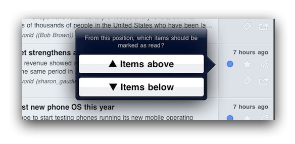
For example, if you press and hold the blue read/unread dot, you’re given the option of marking items read above or below that point.

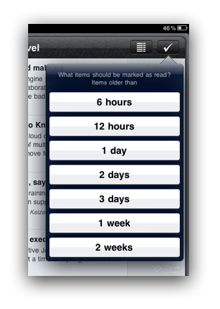
You can also mark items read based on their age by pressing and holding the ‘Mark all as read’ button.

Other really useful feed management tools in Mr. Reader:
I also like how Mr. Reader remembers my last chosen article view. For example, if I last chose Readability to view the full text of a partial text feed, Mr. Reader applies that choice the next time I view an article in that feed. In effect, it transforms partial text feeds into full text feeds with no extra taps on my part.
Since Mr. Reader relies on Google Reader as a source for RSS feeds, there's no reason you have to abandon Reeder—or anything else that uses Google Reader. Everything syncs.
Emotion and failure
Early in our careers, we’re encouraged to avoid failure, and one way we do that is by building up a set of emotions around failure, emotions we try to avoid, and emotions that we associate with the effort of people who fail. It turns out that this is precisely the opposite of the approach of people who end up succeeding.
I so agree.
Remove unwanted love handles from PDF in seconds
Almost all of the PDF files that find their way to me were either created from Microsoft Word documents[1] or scanned from textbook pages. They all have crazy huge margins.
While margins had a practical function in the paper world, they do nothing but waste pixels in digital landscapes, especially on portable screens.[2]
I usually crop PDF files on my MacBook Air to make better use of my 13" screen. It’s really easy to crop all pages in a PDF file at once in Preview:
That works great on a Mac, but I actually prefer reading longer PDF files on my iPad. Good news: I can crop there, too. GoodReader has a really nice cropping tool. Look for the crop icon at the bottom-center of the screen.

Tapping the crop button brings up draggable handles that you can use to trim unwanted fat. It applies your selection to the entire file, too.

It may not sound like a big deal, but cropping dramatically increases the readability of PDF files on the iPad—particularly when reading hundreds of PDF pages (as I often do). By focusing the reading area, pages are much easier to see on a 10" screen. They're a lot easier to turn, too, since zooming is less necessary.
Redesigns
My fling with sans-serif fonts turned out to be short-lived. PE's new design makes heavy use of my favorite serif typeface for the web, Georgia, a font that also has a lot of special meaning to me personally. I am not a great designer. Not even a good designer. But I like to think I've developed a sense for what's not needed. And I've gotten better at acting on that sense.
Generally, this redesign was about subtraction.
I've also redesigned my approach to writing here. Going forward, posting will probably be more erratic and less routine. I feel as though I've reached a tipping point here. I'm also deploying some of the dividends I've been paid here in other pursuits.
More on that later. Hopefully.
Ignorance before focus
In the days and weeks that followed September 11, 2001, the firemen of lower Manhattan had utility bills to pay. They were called by telemarketers. They came home to leaky faucets. They were jabbed by all the usual derailments of modern life.
It didn’t matter, though, because they had The Pile. Ground Zero was the only thing in sight.
Few things inspire focus like tragedy.
I've often wondered if there's a practical way to simulate the positive effects of tragedy, but I really doubt there is. The API for this primal programming is probably closed.
It’s perhaps constructive, though, to consider why people act so efficiently and resolutely amid crisis. My theory: life gets simpler.
The complement of focus
Most people probably think of focus as uni-tasking, or the act of singling out one thing. That’s true. But equivalently, focus is about ignoring the other 99.9 percent that doesn’t matter.
In times of crisis the unimportant goes out of focus naturally.
During times of tranquility and non-urgency, it’s much harder to work through a wide aperture lens. Focus is hard when ignoring is hard. When fear isn’t present to make the unimportant melt to bokeh, your attention naturally becomes spread over many things.
Absent tragedy, we need some other primal motivation to make us ignore. The best I’ve come up with is procrastination, a demon that can actually work for you if you outsmart it.
Channeling procrastination in OmniFocus
I get a lot more done in OmniFocus the less I see in OmniFocus—i.e. the more I ignore. I wish I didn’t need to hide priorities 2–8 from myself so that I can focus on priority 1. I wish it didn’t matter when I see more than I need to see. But it does.
I’ve found that loose start dates are the best tool in OmniFocus for ignoring. If I have a context that shows more than a couple of tasks, I’ll move everything to tomorrow except for what I want to work on next.
It’s an affirmation of the common sense fact that I can’t focus on any one thing until I first choose to ignore everything else.
Procrastinating on low(er) priorities doesn't elicit the same level of productivity as crisis. But it’s as close to tragedy as I can get. Here’s to wishing carefully.
How I take my Gmail
On Back to Work episode 37, Merlin talks about how much he still loves the Gmail web interface. In short, he prefers working out of the web UI, but he still runs Mail 5 for OmniFocus processing—and perhaps for other forms of Merlin magic we aren’t meant to know.
I used only the Gmail web interface for years, but lately I’ve started working more out of Mail 5. I’m finding that instead of choosing one over the other, using both together makes me better at email.
Why I use the Gmail web UI
Triage. Web key commands like j, k, and e let me fly through mail when my inbox is getting out of control. Gmail also does a world-class job of bundling conversations. Yes, better than Mail 5. Gmail’s web UI helps me ignore what I don’t need to see.
Filtering. Gmail’s filters are a godsend. I have too many to list, but they all really accomplish the same goal: keep my inbox clean, regardless of which mail client I’m using. It’s hard for any local mail client to beat the server-side filtering Gmail offers.
Why I use Mail 5
Window size flexibility. I get a lot of email from the students that take my web-based actuarial seminars. These emails often have multiple questions, which require me to reference PDF and other documents. It’s so much easier to align a Mail 5 message window with other windows (e.g. PDF) than it is to align a browser. Being able to see the message window at all times makes replying to these emails far more efficient.
Address book separation. Since Mail 5 and the Mac Address Book are two separate programs, I don’t have to leave mail to view contacts like I do in the Gmail web UI.
Mailbox unification. Mail 5 lets me work with Gmail and non-Gmail accounts in the same place. It creates a lightening-fast unified search environment, too. Love this.
Backup. Simply by running Mail 5 regularly, I’ve created an offline backup of my mail. I know it’s not likely that my Gmail account will vanish from Google’s servers, but nothing’s guaranteed. And how much are you paying Google to guarantee the existence of your email? Yeah.
Mail 5 messages are accessible offline. Some days it’s sunny, and there are no clouds. And sometimes data plans are too expensive or impractical to leave on—like, as Merlin describes, in New Zealand, where data prices seem to be at parity with gold bullion.
The stars align
I do a lot of mail processing on my iPhone and iPad. A lot of the actionable email I get requires me to do something on my Mac with PDF, spreadsheets, and other programs before I respond.
I’ve been using Gmail stars for a long time to flag mail for later processing. It’s by far the most efficient way I’ve found to triage mail using iOS and stay with an Inbox Zero mindset.[1]
Since Mail 5 automatically flags messages in the Gmail “Starred” folder, I can count on having my ducks lined up for shooting when I get back to my Mac. In fact, I probably spend most of time in Mail 5 working out of the Reminders section processing flagged email.
The platform is secondary now
Gmail is a lot like Dropbox in that it’s a ubiquitous form of cloud-based content management. Gmail is platform-independent, so you have lots of choices when it comes to how you view your data.
Best of all, the decision to use any given platform doesn’t preclude you from immediately switching to another platform. IMAP glues it all together. What Merlin said about Dropbox is also true about Gmail: “it’s never not everywhere.”
Hey Brett and Byword, get a room
With Brett and Byword, it was love at first shortcut. He recently reaffirmed his affection by sharing a bevy of Byword's impressive Markdown keyboard shortcut options. Markdown voyeurs, rejoice!
A Bank of America rant, then online check deposit made easy with Hazel and
Years ago, I opened a checking account with Bank of America thinking that their nearly ubiquitous ATM presence would make my life easier. I figured that lots of ATMs meant fast and easy access to my account.
In practice I’ve found that every aspect of the Bank of America ATM experience is about waiting.
It seems that none Bank of America's top brass have ever visited an actual brick and mortar branch. If they had, they would surely notice that virtually none of their outdoor customers drive through human teller lanes anymore.
It’s not unusual at all, particularly in the southeast, where I live, to find four empty teller lanes and five or more people in line at a single ATM.
Maybe I’m living in an alternate reality. Maybe Bank of America tellers have unionized against ATMs. Maybe, using Bernoulli's Principle, bank branch architects rely on the drive-through structure to keep the building from collapsing.
I don’t know. I’m just tired of waiting in line while I watch the wind blow through spaces that would have been occupied by cars in the 20th century—cars that are now in front of me, wanting the same single ATM I do.
Even when your turn finally arrives, using a Bank of America ATM is about waiting. There are noticeable Windows Vista-esque delays between screen transitions, especially when depositing checks.
All that to say, I’m not too keen on the Bank of America ATM experience.
So I’m moving my checking account to Ally Bank, an all-online outfit. Not only does Ally reimburse all foreign ATM fees, they just started offering online check deposit. So far we are getting along really well. Ally works the way I need a 21st century bank to work.
Depositing checks with Hazel and Automator
When I scan checks front and back, my ScanSnap S1100 naturally creates a two-page PDF. Ally requires that checks be scanned to 300 dpi JPEG format, and the front and back must be uploaded as separate images.
I wanted to way to convert the PDF into two separate JPEGs quickly.
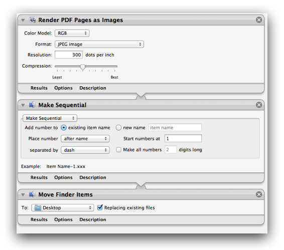
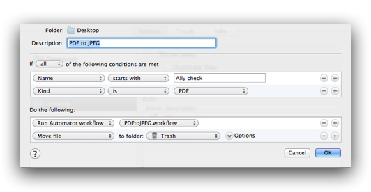
I created a Hazel rule that looks on my Desktop for PDFs that start with “Ally Check”. When Hazel spots one, it sends the PDF to an Automator workflow that converts the two-page PDF into two individual JPEG files. After that, Hazel moves the PDF to the trash.
Thanks to Hazel and Automator, I have a front and back JPEG of my check within split seconds of saving the PDF scan to my Desktop. Way faster than spending gasoline and time at a Bank of American ATM.
The Automator workflow:

The Hazel rule:

Credit to Simon Hobbs for some tips that make the Automator workflow… work.
Creating software license items in 1Password - breakneck speed edition
If you simply drag and drop an app from Finder onto 1Password or its Dock icon, a new Software License item will be automatically created with that app’s icon, name, and current version—half the work’s already been done for you! The only thing left is to paste your license for safe keeping and add any other details you want to hang onto.</p>
Cool.
"But it doesn't do spreadsheets"
One of the most common complaints I hear from other actuaries about the iPad is that it doesn’t do spreadsheets well. Some say it’s a weakness that will ultimately relegate the iPad to the toy pile. Here are a non-prime number of thoughts from an actuary (me) who makes a living on spreadsheets:
One
I’m not sure the iPad ever needs to be a spreadsheet tool to be successful. I see spreadsheet work as a variant of programming. It’s truck work.
The iPad solves many, many non-spreadsheet problems for me. In fact, if all the iPad did was let me read and annotate PDF documents, that would be enough. It doesn’t have to do everything to keep a place in my workflow.
Two
I’m not sure one should do serious spreadsheet work on a touch interface. “Office” applications like Excel were never designed with touch in mind. I think it would be maddening to use the Microsoft ribbon with a finger tip.
Use a stylus instead? Really? I’ve tried Windows Tablet PCs. Imagine a painter with a broken arm and three fingers on his good hand duct taped. That’s the tablet PC experience.
Three
The fact that there aren’t great Excel tools on the iPad in 2011 isn’t an inherent weakness of the iPad or a failure on Apple’s part. It’s a consequence of Microsoft’s decision not to develop Microsoft Office apps for the iPad.
No one is stopping Microsoft from making an iOS Excel app but Microsoft. In fact, Microsoft could develop apps for Word, PowerPoint, Access, and more—if they wanted to. They don’t. And the world is moving on.
Four
The spreadsheet used to be my everything tool. From sophisticated financial modeling to text manipulation to list-keeping to word processing (seriously) to ad hoc arithmetic.
Apps are replacing the need to use spreadsheets for everything. Today, I only use spreadsheets when I really need the power of a spreadsheets. Apps are serving niche uses in ways that conventional software development (and distribution) never could have.
